Vasu Chaudhry

Design Strategist

Wave Athleisure

BRAND & UX/UI DESIGN

How might we design an athleisure identity that is minimal yet full of energy?

ROLE

Brand & UX/UI

Designer

COLLABORATORS

None

DURATION

4 Months

TOOLS

Adobe

Creative

Cloud

Wave Athleisure

BRAND & UX/UI DESIGN

BRAND IDENTITY AND PACKAGING

How might we make vision care interfaces feel both clear and compassionate?

ROLE

Branding & UX/UI Designer

COLLABORATORS

None

DURATION

4 Months

TOOLS

Adobe Creative Cloud

01

Research

  1. THE GAP IN THE CATEGORY

B. THE METAPHOR TO BUILD ON

01

Research

  1. CATEGORY CLICHE TO AVOID

B. SKETCHING THROUGH MOTION

The Category Cliche to avoid
Kissatens are traditional Japanese cafés from the early 20th century, intimate, nostalgic spaces built around hand-brewed coffee, simple Western-inspired meals, and an atmosphere of calm refinement. The brief was to retain that ethos of patience, craftsmanship, and ritual while connecting it to a younger, more online audience shaped by digital nostalgia and anime-inspired subcultures.


Athleisure branding defaults to a narrow visual vocabulary, bold motion lines, aggressive colour, loud energy standing in for athletic credibility. Wave needed to sit outside that, quiet energy instead of shouted energy, structure balanced with flow, versatility built on restraint rather than noise.

Kissatens are traditional Japanese cafés from the early 20th century, intimate, nostalgic spaces built around hand-brewed coffee, simple Western-inspired meals, and an atmosphere of calm refinement. The brief was to retain that ethos of patience, craftsmanship, and ritual while connecting it to a younger, more online audience shaped by digital nostalgia and anime-inspired subcultures.

The Metaphor to build

on

Vision itself, light, focus, openness, became the source material. Rather than illustrate eyecare literally, the brand needed to embody the feeling of clearer sight: transparency as both a value and a visual principle.

Sketching through motion

Early exploration moved through dynamic typography and athletic silhouettes, testing how much movement a mark could imply without becoming literal. Colour palettes were tested across light, shadow, and texture to find something that read as "activewear" without reaching for the obvious.


02

Concept

  1. THE LOGOMARK

B. PALETTE & TYPE

02

Concept

  1. THE MARK

B. PALETTE BUILT FOR RESTRAINT

The mark

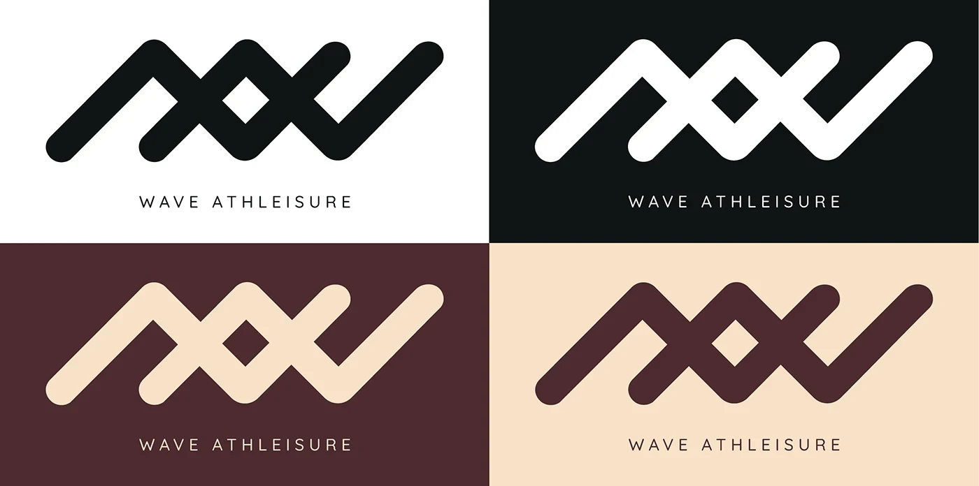
The Wave wordmark builds from a continuous zigzag line, doing double duty as both a W and a literal wave, motion encoded directly into the letterform rather than illustrated around it. It holds up in reverse, in outline, and in either brand colour, Brown Coffee or Bisque, without losing legibility.
A palette built for restraint

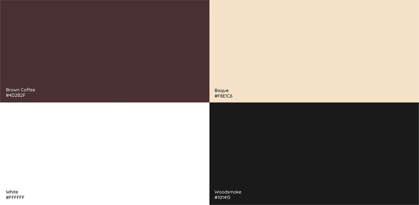
Four colours, Brown Coffee, Bisque, white, and Woodsmoke, keep the system warm and grounded rather than loud. No neon, no obvious "sport" red or electric blue, the palette itself is the argument that energy doesn't require volume.

03

Execution

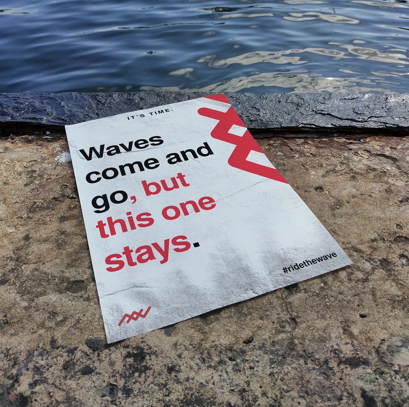
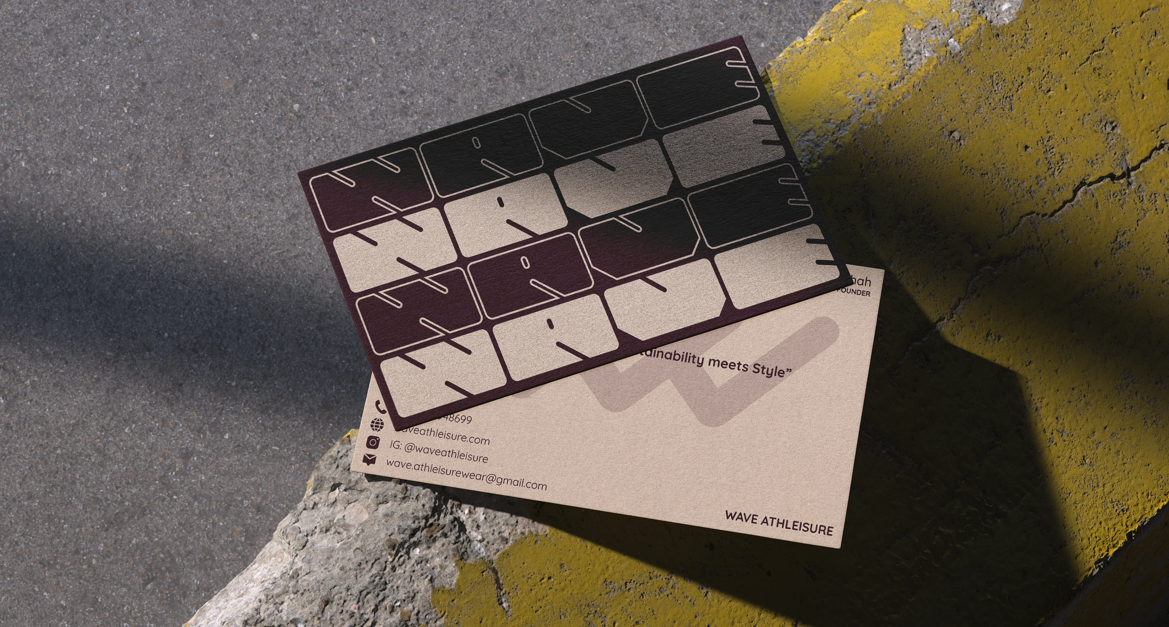
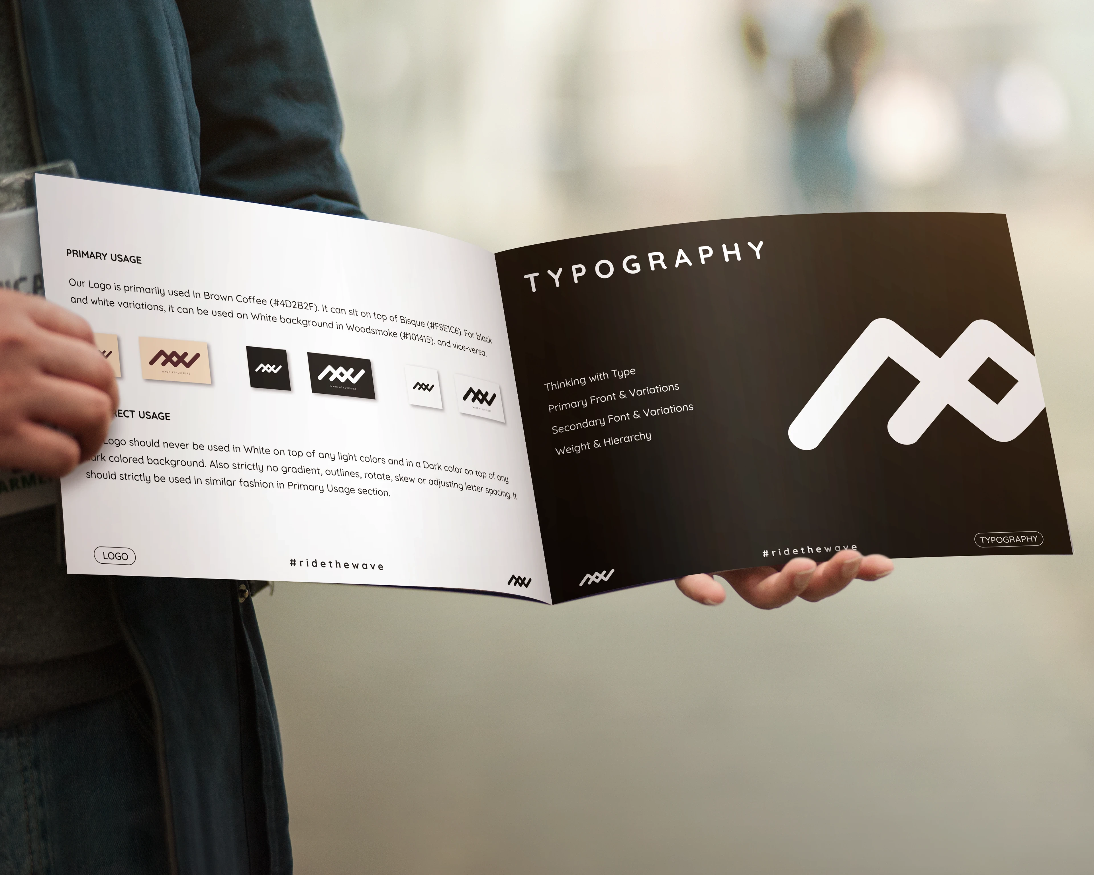
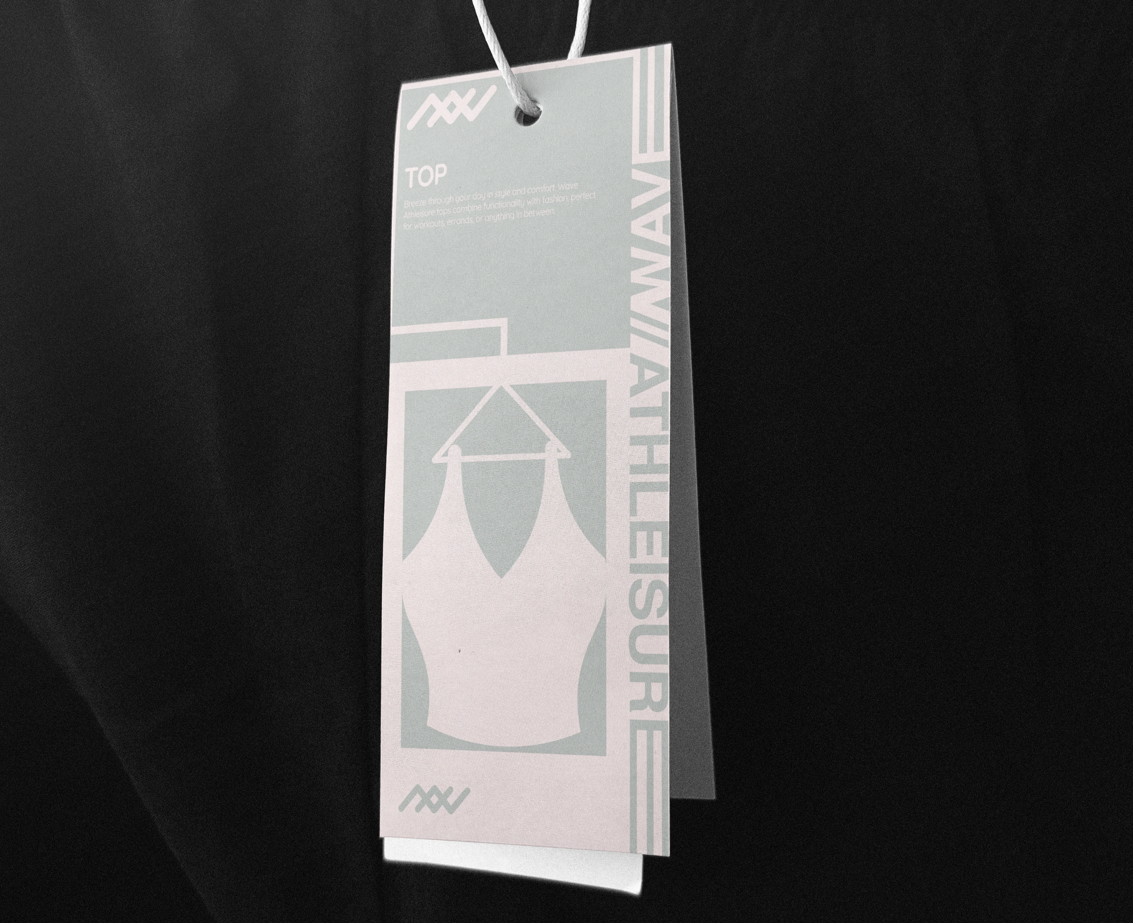
The identity extends across the full range a real launch requires, business cards, hangtags per product category (shorts, tank tops, leggings, tops), a brand guideline booklet, and posters carrying the brand's tone into copy, "Waves come and go, but this one stays." Each touchpoint uses the same mark and palette without feeling like a copy-paste repeat.
Image
Image
Image
Image

The digital layer

The website extends the identity into a full e-commerce structure, sitemap, wireframes, and high-fidelity screens across category, product, and account pages. A user flow was mapped alongside the sitemap so navigation logic was decided before visual design began, similar in spirit to GharSe's architecture-first approach.

Reflections

The restraint is what makes this identity work, a mark that implies motion without shouting it, a palette that argues energy doesn't need volume to read as energy. That discipline holds consistently across the logo, the hangtags, the guideline system.


Where I'd push further is the marketing voice against that same standard. The posters, "waves come and go, but this one stays," "think of a winner," carry a punchier, almost confrontational tone that sits at odds with the quiet-energy positioning everywhere else. A system built on restraint should probably extend that restraint into copy too, or the brand risks feeling like two different voices depending on which touchpoint someone meets first.

Vasu Chaudhry

Work

About

Thinking

Instagram

LinkedIn

Medium

Vasu Chaudhry

Work

About

Thinking

Instagram

LinkedIn

Medium

Vasu Chaudhry

Work

About

Thinking

Instagram

LinkedIn

Medium

Create a free website with Framer, the website builder loved by startups, designers and agencies.