Vasu Chaudhry

Design Strategist

Kissaten

BRAND IDENTITY AND PACKAGING

How might we revive Y2K nostalgia in branding without losing precision or elegance?

ROLE

Comm.

Designer

COLLABORATORS

None

DURATION

4 Months

TOOLS

Adobe

Creative

Cloud

Kissaten

BRAND IDENTITY & PACKAGING

BRAND IDENTITY AND PACKAGING

How might we revive Y2K nostalgia in branding without losing precision or elegance?

ROLE

Communication Designer

COLLABORATORS

None

DURATION

4 Months

TOOLS

Adobe Creative Cloud

01

Research

  1. THE REFERENCE POINT

B. THE TENSION TO RESOLVE

01

Research

  1. THE REFERENCE POINT

B. THE TENSION TO RESOLVE

The Reference Point

Kissatens are traditional Japanese cafés from the early 20th century, intimate, nostalgic spaces built around hand-brewed coffee, simple Western-inspired meals, and an atmosphere of calm refinement. The brief was to retain that ethos of patience, craftsmanship, and ritual while connecting it to a younger, more online audience shaped by digital nostalgia and anime-inspired subcultures.


Kissatens are traditional Japanese cafés from the early 20th century, intimate, nostalgic spaces built around hand-brewed coffee, simple Western-inspired meals, and an atmosphere of calm refinement. The brief was to retain that ethos of patience, craftsmanship, and ritual while connecting it to a younger, more online audience shaped by digital nostalgia and anime-inspired subcultures.


Kissatens are traditional Japanese cafés from the early 20th century, intimate, nostalgic spaces built around hand-brewed coffee, simple Western-inspired meals, and an atmosphere of calm refinement. The brief was to retain that ethos of patience, craftsmanship, and ritual while connecting it to a younger, more online audience shaped by digital nostalgia and anime-inspired subcultures.

The Tension to resolve

Quiet ritual meets bold subculture. Anchored in the meticulous, patient origins of Kyoto-style cold drip, but visualized through playful, futuristic energy, retro meeting future rather than one replacing the other.

The Tension to resolve

Quiet ritual meets bold subculture. Anchored in the meticulous, patient origins of Kyoto-style cold drip, but visualized through playful, futuristic energy, retro meeting future rather than one replacing the other.


02

Concept

  1. BRAND DIRECTION

B. FINDING THE BALANCE

02

Concept

  1. BRAND DIRECTION

B. FINDING THE BALANCE

Brand Direction

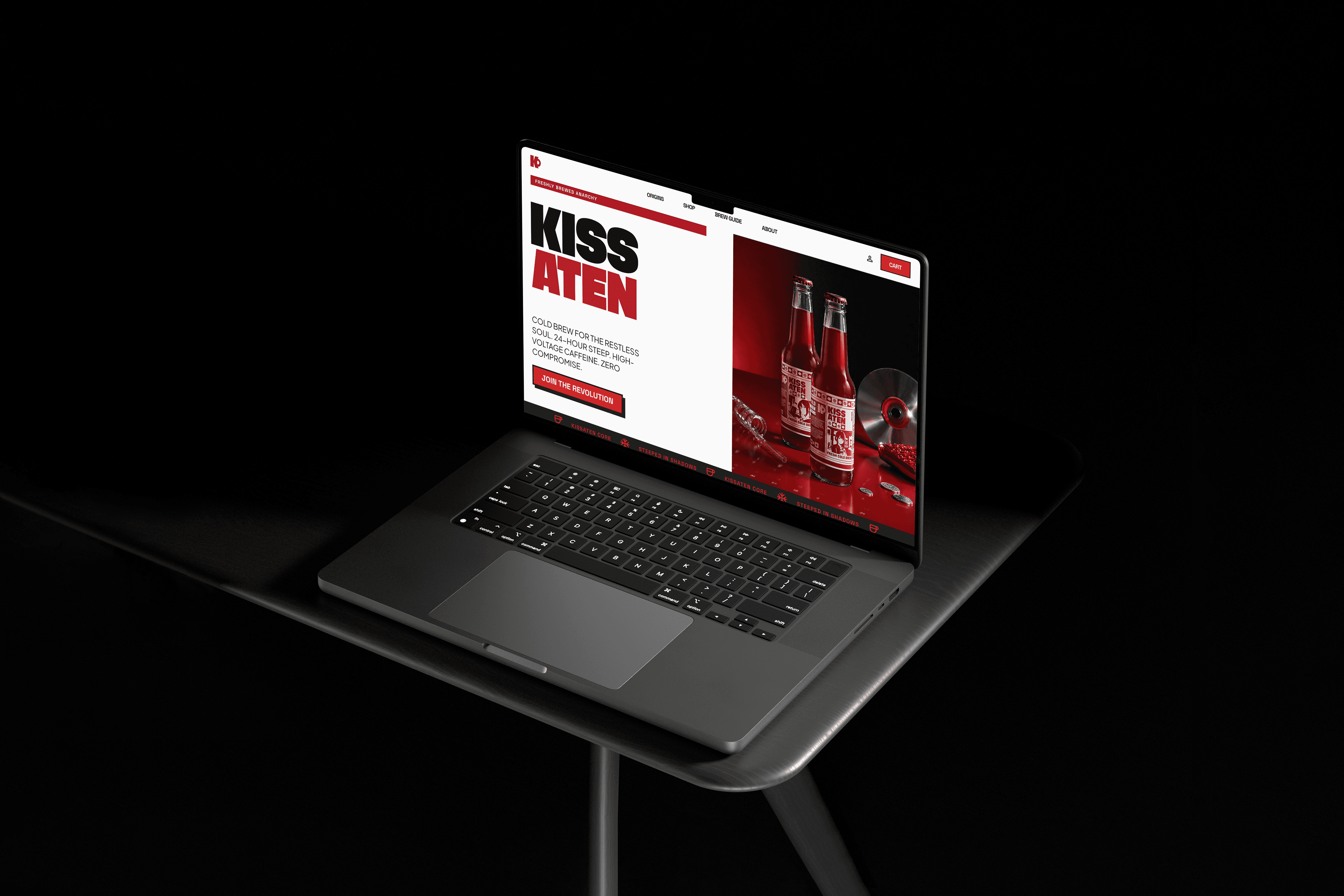
Visual identity as a system, monogram, wordmark, and abstract marks carrying stylized Y2K detailing throughout. Tone calm yet energetic, where traditional hospitality meets cultural remix. Positioning Kissaten as more than a café, a cultural crossover space blending Japanese heritage with global subcultural aesthetics.

Finding the balance

The packaging came alive through sketching sessions inspired by Y2K nostalgia, golden ratio layouts, and the physical texture of cold brew bottles. Label fits, cap interactions, and colour shifts were tested across both in-hand prototypes and digital mockups. The design honed in on balance, elegant yet approachable, modern yet warm, tuning font weights, foil accents, and negative space until every angle felt right.
The label as a story

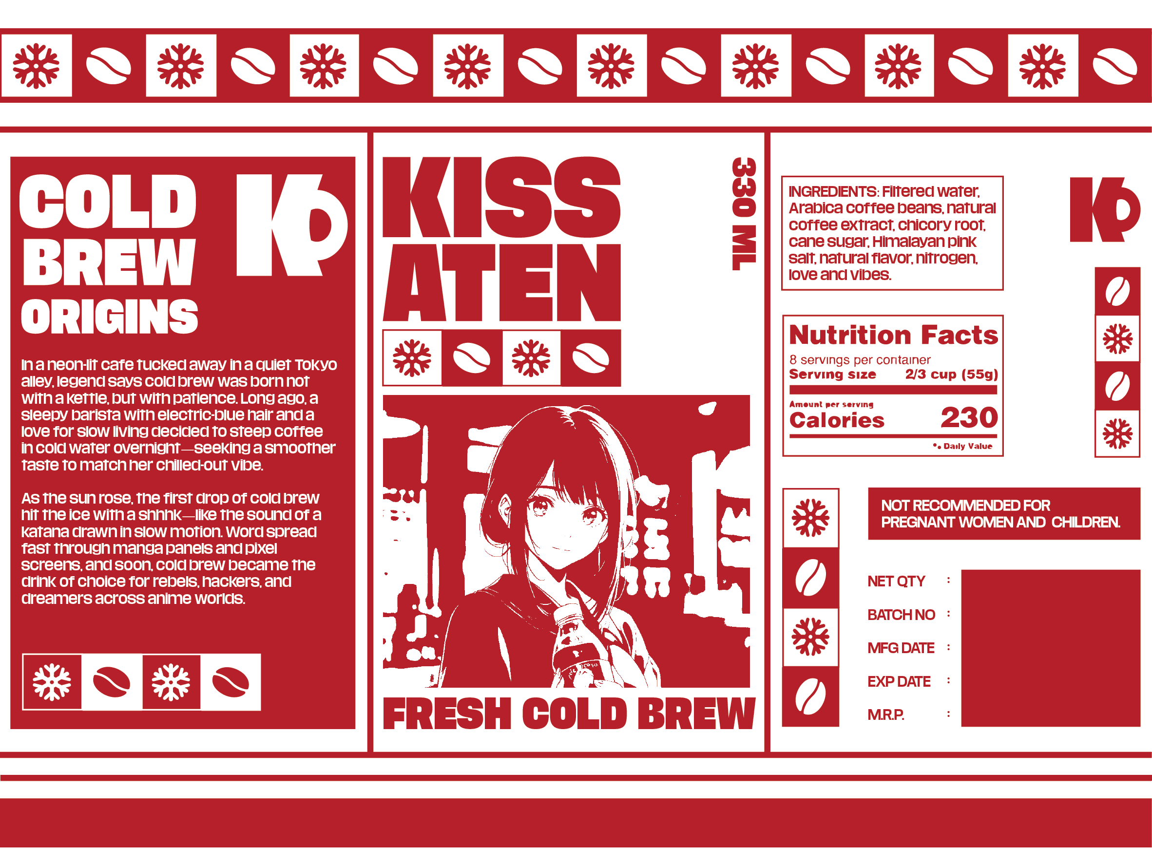
Cold Brew Origins runs as a short in-universe legend printed directly on the label, a sleepy barista with electric-blue hair steeping coffee overnight in a neon-lit Tokyo alley. It's a small detail, but it does real work, it gives the product a world to live in before a customer has taken a single sip, and it justifies the anime character motif as narrative rather than decoration.

System over single asset


The identity was built to travel, monogram, wordmark, and iconography (snowflake and coffee bean motifs) repeating across the label, the packaging, and brand collateral, so the visual language holds together whether it's on a bottle, a menu, or a social post.

03

Execution

  1. THE LABEL AS A STORY

B. SYSTEM OVER SINGLE ASSET

The label as a story

Cold Brew Origins runs as a short in-universe legend printed directly on the label, a sleepy barista with electric-blue hair steeping coffee overnight in a neon-lit Tokyo alley. It's a small detail, but it does real work, it gives the product a world to live in before a customer has taken a single sip, and it justifies the anime character motif as narrative rather than decoration.

System over single asset


The identity was built to travel, monogram, wordmark, and iconography (snowflake and coffee bean motifs) repeating across the label, the packaging, and brand collateral, so the visual language holds together whether it's on a bottle, a menu, or a social post.

Image
Image
Image
Image

Reflections

Kissaten solved for a single, high-stakes touchpoint, the bottle. It had to carry the entire tension of the brand, ritual and subculture, heritage and remix, on one small physical surface, and it does that convincingly. What it doesn't yet prove is that the identity survives beyond it. The deliverables scope named packaging, menus, merchandise, digital presence, and café interiors, but only packaging has been designed and shown. A monogram and icon system built for a label is a different design problem than the same system living on a menu someone reads in low light, or a wall someone sits in front of for an hour.


If I extended this project, that's the next test: does the Y2K-anime tension still feel intentional, and not just decorative, once it's stretched across a physical space rather than a 330ml surface. A strong bottle is proof of craft. A coherent café is proof of a system.

Vasu Chaudhry

Work

About

Thinking

Instagram

LinkedIn

Medium

Vasu Chaudhry

Work

About

Thinking

Instagram

LinkedIn

Medium

Vasu Chaudhry

Work

About

Thinking

Instagram

LinkedIn

Medium

Create a free website with Framer, the website builder loved by startups, designers and agencies.