


The Logomark
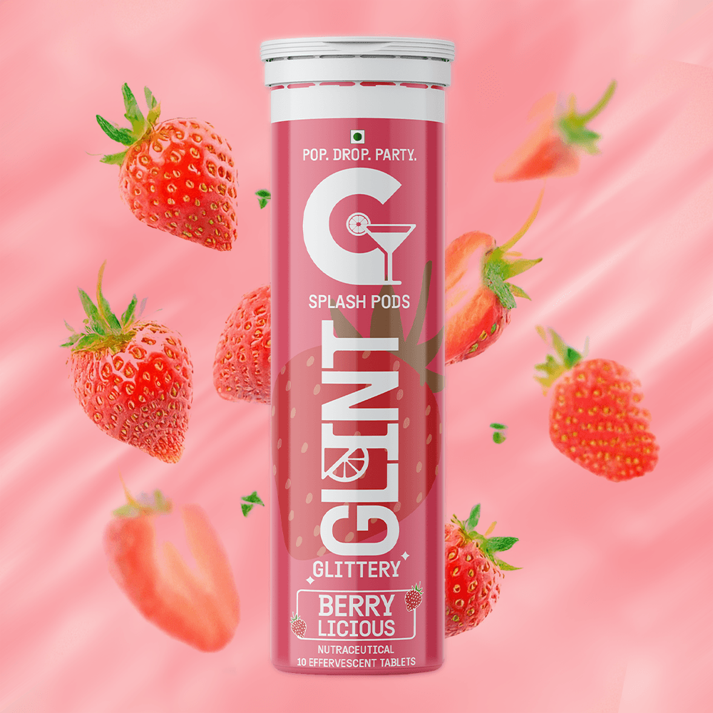
The wordmark builds the fizz directly into its letterforms, a lime slice replacing the dot on the "i," a martini glass integrated into the "G." The G anchors the brand with bold simplicity, while the martini glass signals refinement and a celebratory lifestyle rather than a clinical one. Nothing about the mark reads as medical.

Color as flavor
Rather than one fixed palette, colour shifts by flavour, teal for green apple, coral for strawberry burst, red for watermelon, so the range reads as varied and giftable on a shelf rather than one SKU repeated in different shades.


03
Execution
Rather than studio-only product shots, the identity was tested in real social contexts, a poker night, a cocktail glass, to prove the branding performs in the settings it's actually designed for, not just in isolation.


Reflections
The strongest move here is refusing a single fixed palette, letting colour shift by flavour instead. It turns what could've been a static identity into something that reads as a real range, varied enough to feel giftable, consistent enough to still say Glint at a glance.
What I'd test further is whether "premium but approachable" survives next to an actual shelf of competitors, not just in isolation. The lifestyle photography proves the brand performs in the moments it's built for, a party, a pocket, but there's no comparison shown against the pharmaceutical-style packaging it's explicitly trying to break away from. Seeing Glint next to that clinical shelf standard would prove the differentiation the whole brief was built on, rather than just asserting it.